Client: Lost Paradise of Dilmun (LPOD)
Elements:
Brand & DesignBrand Strategy
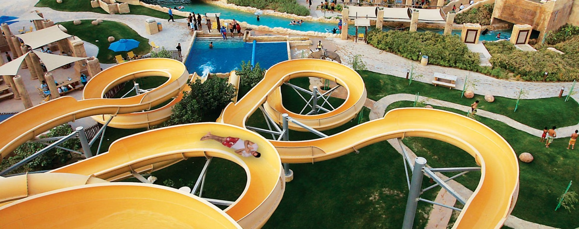
The brand positions itself as an international standard water park and wanted the brand to truly reflect that.
FROM6 was selected for this project due to its strategic and design capability.

We looked beyond the brand mark itself and really focused on how the brand would work as a long term execution across a range of channels and customer touch-points.
The new identity was cleaner and simpler, to communicate the brands core purpose of giving people a fun and engaging, world-class water park experience in Bahrain. We also focused on creating the brand mark in arabic and english, while maintaining the overall look and feel, with consistency in the design elements making up the brand marks.

The fonts were chosen to be bold, friendly and fun and were selected to offset the historical elements of the water park theme to give a juxtaposition between old and new through out the water park.

The refreshed colour palette was inspired by the Lost Paradise of Dilmun facility itself drawing from the colours of the water, stone work and Dilmun culture in the water park.


The fifth element was created to have a flowing and twisting feel representing the flow of water in blue and a the curving movement of the water slides represented in the different coloured lines, with the end result being a fifth element with a lot of movement and energy.


