![our-services-hero-image.jpg](https://from6.com/wp-content/uploads/2023/08/occep_hero_f00f619236.avif)
Client: Oman Oil Company Exploration & Petroleum
Elements:
Brand & Design
The first step was to look at OOCEP and their core purpose, which was one of exploration and discovery.
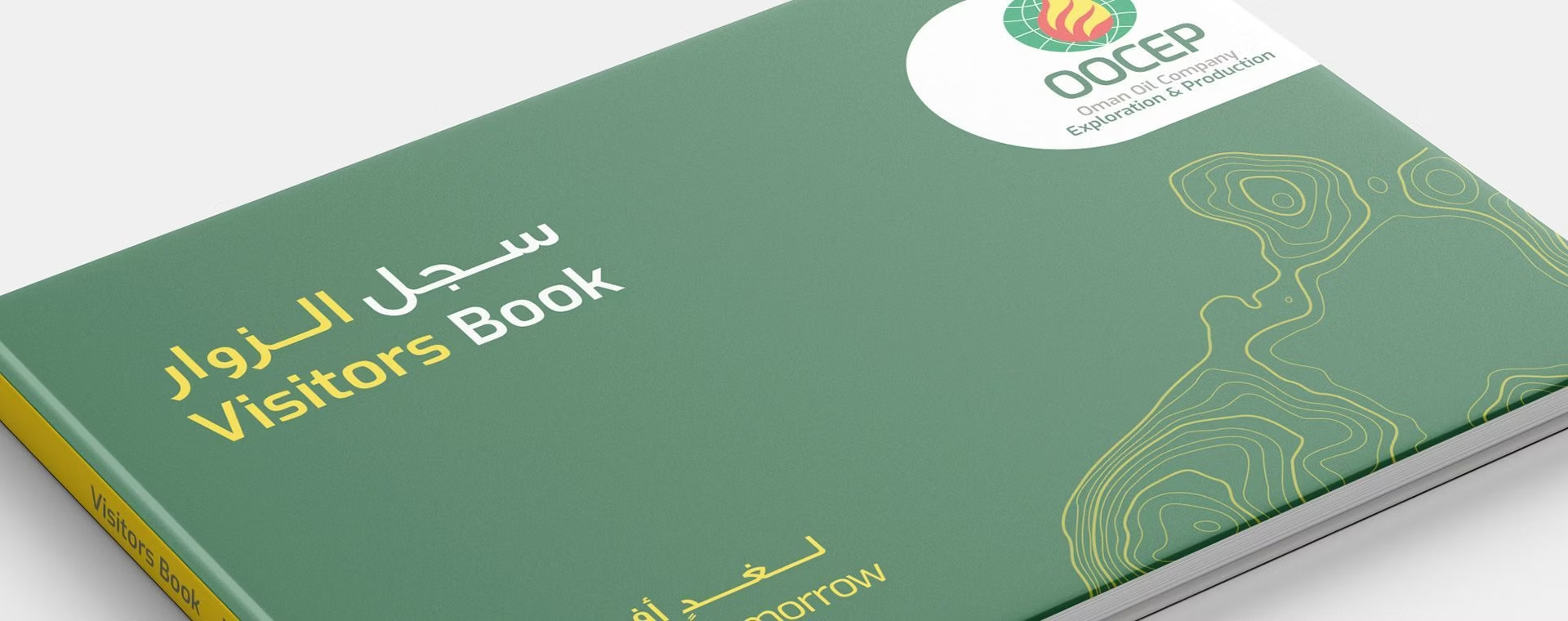
A new colour palette was created to work better in conjunction with primary brand mark colours a inspired by the colours of the Omani Landscape.
![occep_1_a09d7c57a3](https://www.from6.com/wp-content/uploads/2023/08/occep_1_a09d7c57a3.avif)
New fonts were selected to have an advanced technological feel.
![occep_2_88a7741e72](https://www.from6.com/wp-content/uploads/2023/08/occep_2_88a7741e72.avif)
A new suite of graphic icons to complement the geo-contour lines, developed to have smooth corners flowing without sharp inorganic corners.
![occep_3_8181d7d4f4](https://www.from6.com/wp-content/uploads/2023/08/occep_3_8181d7d4f4.avif)
We defined a new image style reflecting a action orientated photography, images moving with dynamism, energy showing the highest degrees of professionalism. With images including the primary brand colours of yellow, red and green.
![occep_4_b94b15664f](https://www.from6.com/wp-content/uploads/2023/08/occep_4_b94b15664f.avif)
We developed a new fifth element for the brand with graphic geo-contouring lines. A key element in the discovery process.
![occep_5_f0be3fb040](https://www.from6.com/wp-content/uploads/2023/08/occep_5_f0be3fb040.avif)
![occep_6_5a4db0f0bc](https://www.from6.com/wp-content/uploads/2023/08/occep_6_5a4db0f0bc.avif)
![occep_7_1c8b730c26](https://www.from6.com/wp-content/uploads/2023/08/occep_7_1c8b730c26.avif)
![occep_8_38d4713be3](https://www.from6.com/wp-content/uploads/2023/08/occep_8_38d4713be3.avif)
![occep_9_8fdd015b80](https://www.from6.com/wp-content/uploads/2023/08/occep_9_8fdd015b80.avif)
![occep_10_432b9915a0](https://www.from6.com/wp-content/uploads/2023/08/occep_10_432b9915a0.avif)